
Although my aim has always been to produce pictures which truely reflect what the Moon really looks like, I have to admit that these often lack contrast and appear rather flat. The darkest parts of the Moon are the shadows. The overall albedo of the Moon is about 0.12, which means that only 12% of the light incident on the Moon is reflected, and much of that light reflects back in the general direction of the Sun. The evidence for this last statement is the fact that the Full Moon is significantly brighter than at other phases. The maria cover about 30% of the visible side of the Moon and have an albedo of about 0.08 from which one can deduce that the average albedo of the highlands is only about 0.14 if the overall average is 0.12. This is a factor of only 1.75. So the rather flat appearence of faithful images is understandable. Any attempt to increase the contrast in some areas will inevitably result in loss of contrast in others. However there are a number of ways of increasing the contrast which have slightly different effects.
More recently I have been using a DSLR along with my Ritchey-Chrétien telescope. This combination enables me to capture the whole Moon in one frame at quite high resolution. However my DSLRs have a very non-linear response to light and this gives rise to very different images depending on the exposure I give it. I have tackled this question elsewhere, and the purpose of this page is to discuss the effect it has on pictures of the Moon.
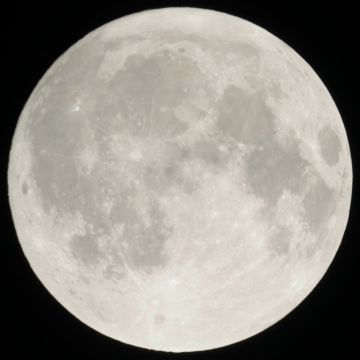
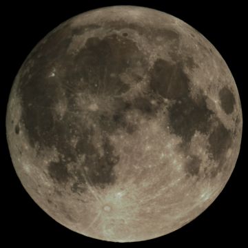
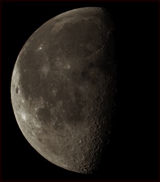
My first example is my picture of the Full Moon. The original picture, on the left below, was taken with a 5 mS exposure giving a maximum signal of 245 and the ratio of the brightest areas (Tycho) to the maria (Imbrium) was only 1.4 and the picture looks very flat indeed. I increased the contrast by reducing the gamma to 0.25 and this image is the middle image below. The corresponding ratio is 4.4. The right-hand picture results from my linearisation technique and the ratio is 2.9.
 |
 |
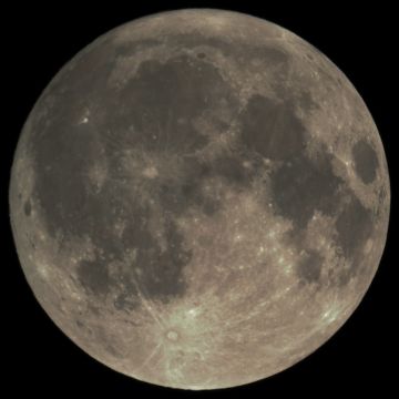 |
The improvement in the two processed images is obvious. In my view the centre image has rather too much contrast, but look carefully at Tycho (the prominent crater near the bottom of the image) and you can see that the right-hand image has slightly better contrast than the centre one. Similar small differences can be seen in other bright areas
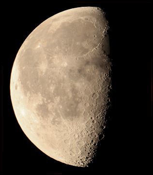
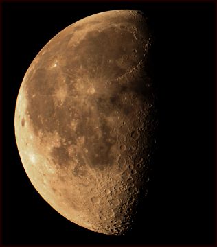
For my second example I have used my picture of Day 20 in my high-resolution images. On the left is the original picture taken with a fairly long exposure (12.5 mS). In the centre is the same picture with the gamma reduced to 0.4, and on the right-hand side is the same image treated by my linearisation technique. The obvious effect that the reduction of gamma has caused is that the picture has become distinctly pink. This is caused by the fact that the original has very slightly more red in it than green and slightly more green than blue but this is not noticable to the eye. However the low-gamma curve increases the slope of the response at the high end of the response curve so that the red is increased significantly more than the blue and this results in the pinkish hue. My linearisation technique allows for this and adjusts the colour of each pixel to be the same as in the original image. The other thing to notice is that there is a bright patch near the south-west limb. This doesn't show at all on the original image, but shows a little more in the centre image, but shows up clearly in the right-hand image. There are similar differences in other bright features, Aristarchus for example. Having said all that, however, the Apennine Mountains show up better in the original and gamma-reduced pictures than they do in the linearised one. They are close to the terminator, so the light is low there and the non-linearity of the original image enhances that area.
 |
 |
 |
So why are DSLRs made that way? I attempt to answer that here.
Home Back to the Moon