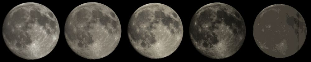
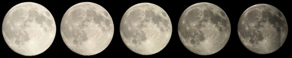
Since I started photographing the Moon using a Canon 1100D DSLR, I have become aware that the image can look quite different depending on the exposure used. This is illustrated below by five pictures of the Moon taken within a few minutes of one another using different exposures, all at ISO 400. These are the set taken on Day 13.5, or around 18 hours before Full Moon, in my set of high-resolution images of the Moon. Below each is the exposure in milliseconds. Since the shorter exposures are inevitably darker than the longer exposures, I show below these the same pitures with their histograms stretched to compensate for the reduced exposure. Each of these pictures is a mosaic of two images and the last image did not merge correctly and the join shows. I'm not sure why but the join does not affect the current discussion and I have not used this image outside of this discussion.
 |
| 4 mS |
2 mS |
1.25 mS |
0.5 mS |
0.25 mS |
 |
The contrast within the picture is lowest in the highest exposure and highest in the lowest exposure. This looks like non-linearity of the camera's response to light. So I decided to investigate.
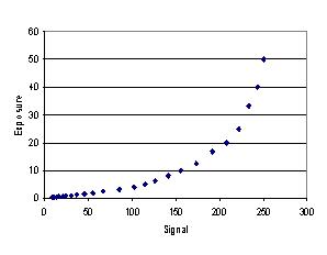
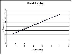
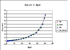
To calibrate the camera, in a darkened room I set the camera up on a tripod about 2 metres from my flat-field light box. This box is home made and consists of strips of white LEDs about 2 cm behind a diffusing screen. (It was made by cutting down an overhead light panel.) I removed the lens from the camera so that the sensor was directly exposed to the light, and took photographs at ISO 400 at all the preset exposures from 1/4000 sec to 1/20 sec (0.25 mS to 50 mS). The sequence was done twice, once in each direction. The pictures were loaded into IrfanView, which has a histogram that encompasses the whole of the picture and a digital display. I averaged the results from the two passes (which were generally identical) and plotted these results against the exposure time. The result is shown below alongside a double-log plot. (Signals run from 0 to 255.)
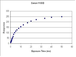 | 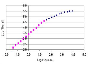 |
The log-log curve seems to divide into two or three straight lines, which means that each part could be represented by an equation of the form log(y) = a.log(x) + K. I implemented this idea and it worked well. However, when I applied it to my Canon 600D, the curve did not seem to divide so neatly and I approached the problem in a much more straightforward way. I describe this for the 600D below but have also implemented it for the 1100D, as indicated below.
My 600D presents an additional problem in that it has been modified by removal of its internal filter, which means that its response to red light greatly exeeds its response to green light and its green response exceeds its blue response. However when I first obtained this camera I worked out a custom white balance that would compensate for the loss of the filter. So I used this custom balance for these calibrations.
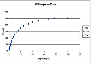 |  |
Calibrating the 600D in the same way yielded the first curve on the left.
I have plotted the signal from each of the three colour channels and you can see that they all fall on a common line, indicating that my custom white balance is achieving its object. If I plot this curve the other way round, I get the curve in the second picture here.
I then used Microsoft Excel to calculate a fifth-order polynomial equation to fit this curve (I actually used the green data) and this gave a correlation coefficient of 0.9992 inicating a good fit to the data. (A fourth-order polynomial gave a slightly poorer fit and a sixth-order gave a slightly better fit of course, but the fifth-order was good enough). This equation enables me to calculate the exposure corresponding to any given signal. This will be the exposure in milliseconds, but express this as a fraction of the actual exposure used during calibration in milliseconds and we have the relative intensity of the light striking any given pixel.
In mathematical terms:
E = f(S), where E is the effective exposure, S is the signal, and f is the polynomial. If Smax is the maximum signal present in the picture, then Emax = f(Smax) is the maximum effective exposure, so E/Emaxis the fraction of the maximum light that reached a pixel giving a signel of S. Multiplying this by 255 gives the linearised signal which is also histogram stretched. In the computer program I wrote to implement this idea I made the final 255 in my description above an operator input which can be entered either as a fixed number or as a percentage of the maximum. This enables me to adjust the stretch of the histogam and I find that setting it somewhat below the maximum gives a nicer picture even though some pixels are saturated. Generally there are very few pixels with a brightness above 90% of the maximum and the saturation is not noticeable but it does brighten the whole picture.
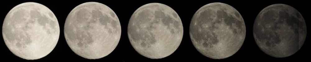
Finally here are the five pictures from above with the linearised versions below them. I leave it for you to descide if the effort is worthwhile.
As might be expected the first three linearised pictures are almost identical. I don't know why the fourth is a bit darker but it could be adjusted using the histogram stretch. The fifth picture shows the danger of pushing these ideas too far. The maximum signal in the original picture was only 94, which is well within the linear part of the camera response curve, so the pictures does not need to be linearised futher. (Indeed the stretched version above is very similar to the linearised versions of the more-exposed pictures.) What we see here is the result of the digital nature of the picture. The conversion rountine applied to a signal of 94 yielded 9, so the picture only has nine intensity levels within it. Hence the featureless appearence.
Why do DSLRs work this way? I attempt to answer this question here.
Home Back to the Moon