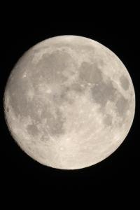
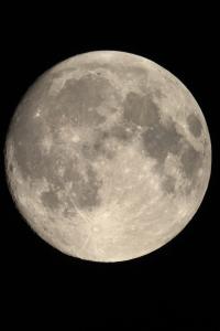
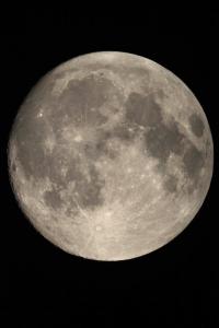
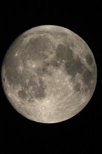
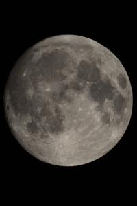
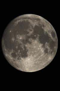
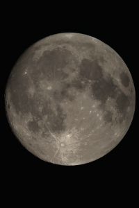
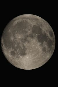
Since I started photographing the Moon using a Canon 1100D DSLR, I have become aware that the image can look quite different depending on the exposure used. This is illustrated below by four pictures of the Moon taken within a few minutes of one another using different exposures. Since the shorter exposures inevitably give darker pictures, I have stretched the histogram of the darker ones to match the brightest one. I chose a picture of the nearly-full Moon as I think the changes are more easily seen at full phases. This one is on Day 13.5 or around 18 hours before Full Moon.
 |
 |
 |
 |
| 1/400 sec, ISO 400 |
1/1250 sec, ISO 400 |
1/2000 sec, ISO 400 |
1/2500 sec, ISO 400 |
The contrast within the picture is lowest in the highest exposure and highest in the lowest exposure. This looks like non-linearity of the camera's response to light. So I decided to investigate.
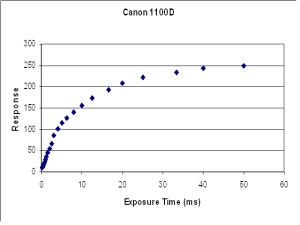
To calibrate the camera, in a darkened room I set the camera up on a tripod about 2 metres from my flat-field light box. This box is home made and consists of strips of white LEDs about 2 cm behind a diffusing screen. (It was made by cutting down an overhead light panel.) I removed the lens from the camera so that the sensor was directly exposed to the light, and took photographs at ISO 400 at all the preset exposures from 1/4000 sec to 1/20 sec (0.25 mS to 50 mS). The sequence was done twice, once in each direction. The pictures were loaded into IrfanView which has a histogram that encompasses the whole of the picture and a digital display. I averaged the results from the two passes (which were generally identical) and plotted these results against the exposure time. The result is shown below alongside a double-log plot. (Signals run from 0 to 255.)
 | 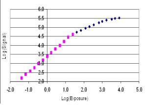 |
It can be seen that the log-log curve divides into two or three straight lines. This means that each part can be represented by an equation of the form log(y) = a.log(x) + K. The curve in the log-log plot seems to divide neatly as indicated by the colours. A straight line can be fitted through the pink set by the method of least squares and yields a correlation coefficient of 0.9995 which indicates an almost perfect fit. However the LMS regression through the blue set has a correlation coefficient of only 0.97, and it does appear to split into two at about log(exposure) 3.3. The lower part of this data has a regression coefficient of 0.997, and the upper part 0.972.
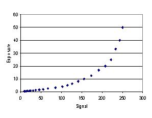
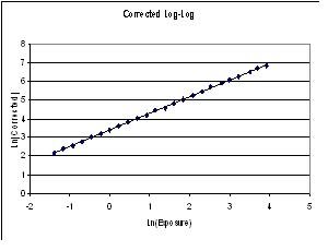
My conclusion is that the response can be divided into three sections in which the photographic gamma (a in the above equation) is 0.884 over the range of signals 0 to 100, 0.420 over the range 101 to 220, and 0.172 in the range 221 to 255, the last range being fairly unreliable. Out of interest, two more graphs can be made. The first shows the correction curve based on these equations, and the second plots the response curve corrected in this way on a double-log plot. The latter is a very satisfactory straight line of slope 0.885 and a correlation coefficient of 0.9997.
 |
 |
It is worth making two points here.
Firstly, the corrected curve is an excellent straight line on the log-log plot so can be used with confidence to correct real pictures. The gamma of the final picture is 0.88. I could have corrected the whole curve to a gamma of 1.0, but I preferred to leave the bottom part of the curve as is and correct only the upper part to be an extension of the lower part.
Secondly, the correction curve becomes very steep as it gets towards the upper end of the dynamic range (above about 220) and this can have an adverse effect in colour images. Suppose, for example, the original picture is colourless to the eye, as most pictures of the Moon are, but contain subtle colours that may be real or may be due to a slight imbalance in the white balance of the camera. Suppose the red signal is slightly higher than the green and the blue. This may not be noticeable in the original picture, but if the signal is near the top of the dynamic range, the red will be magnified more than the green or the blue and this can give the picture a pink tinge in the brighter areas. I noticed this in the early tests of this procedure. To prevent this I have normalised each pixel to the green content in such a way that the ratio of the red and the blue to the green is the same in the converted image as it is in the original. This removes the pink tinge without making the image monochrome.
I wrote a computer programme to implement these ideas which also enables the operator to insert a maximum signal and the software then effectively stretches the histogram to that upper value, anything above that limit is set to 255. The results of this process on the three images at the top of this page are shown below. I have reproduced the original pictures from above first so that comparison is easier.
| Original |
|
|
|
|
| Corrected |
 |
 |
 |
 |
Exposure
Histogram Limit |
2.5 ms
235 |
0.8 ms
192 |
0.5 ms
150 |
0.4 ms
130 (mouseover 120) |
As is to be expected, the least effect is on the shortest exposure and the greatest on the longest exposure. This not surprising as the shortest exposure is mostly within the range that is not affected by this process. However the brightest pixels are at about 130 and the histograms have been stretched to that figure in both examples. The picture with the longest exposure is, of course, most affected and, I think, considerably improved. However its histogram does extend beyond 220 into the area where the greatest enhancement occurs and this area has to be considered unreliable. My feeling for the future is to limit the histogram to no more than 220 in the original pictures and use this correction routine, rather than restrict the original capture to less than half the dynamic range of the sensor. I do not know if this effect is an intrinsic property of CMOS sensors or is built into the camera for some photographic reason. I hope, however, that my corrections produce a picture that looks more like the Moon really did than the originals. You may judge that for yourself.
Finally a decision has to be made as to where to limit the linearisation process. So far I have normally put this limit just above the brightness of the brightest pixel in the image. Usually there is only one such pixel in the image and there are often very few pixels with a brightness just below this. So it may produce a more pleasing picture by setting the limit a little lower. The effect can be seen on the lowest, right-hand image above. The brightest pixel in the original version of this image was 129 so I set the limit at 130. The resulting image is a little dark and spots like Aristachus, or the area around Tycho, which might be expected to be very bright are not so bright. If you move your mouse over this image, you will see another version linearised with a limit of 120. This should result in a few pixels (less than 100 I believe in the original 12 megapixel image) being saturated. You may not notice these in the reduced image shown here but you will notice a general increase in brightness.
There are various ways in which these images can be further enhanced to bring out desirable contrasts. On the next page I show two examples based on my own images.
Home Back to the Moon
